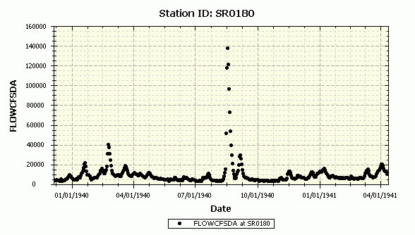
Time series graphs display values associated with the selected Station ID and PCode versus time. Data series derived from data tables are initially formatted as symbols with no lines, whereas those from model output files (BMD) are formatted as lines with no symbols (thus suitable for comparing predicted and observed values for model calibration).
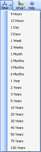
Normal procedures can be used to set the axis scale and zoom in or out (see Using the Graph Control) or you can easily set the time range using the Graph menu to toolbar item to one of several standard values:
Note that there are three ways to format the date axis using the Graph Options dialog: Date, DateAdaptive, and Date_Julian. Date_Adaptive looks like this (the major interval changes from yearly to monthly to daily as you zoom in):
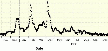
Date_Julian will compress all the data into a single pseudo year so that seasonal variations can more easily be observed:
